Product Design
Teen Online-Safety App (Tozi)
Outcomes
The context
The Vodafone Foundation wanted to promote online safety for teenagers — a high-profile project within the company. The audience was brutal in the best way: 11–15 year olds who abandon anything that feels preachy, boring, or like it was designed by adults.
The problem
How do you get teenagers to choose to spend time in a safety app? Early assumptions had to be tested, not trusted — including my own.
What I did
- Ran user interviews, focus groups and moderated usability testing with the target age group, including an in-person focus group with 11–15 year olds.
- Built personas and empathy maps to surface real frustrations — like having mocking videos posted about you and being afraid to tell your parents.
- Mapped 30+ user journeys with technical stakeholders involved early so designs stayed feasible.
- Wireframed, prototyped and iterated rapidly on user feedback.
- Facilitated design workshops connecting front-end design with backend development.
Results
25,000 users in Ireland after launch and 60% retention driven by the tested notification strategy. The ISPCC's CEO publicly endorsed it.
What I'd do differently
I'd bring engineering into discovery even earlier — the feasibility trade-offs we hit in prototyping were predictable — and I'd instrument the journeys from day one so retention insights arrived in weeks, not months.
Persona
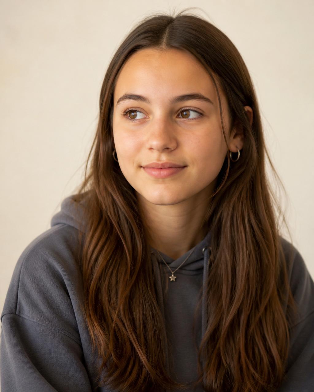
Emily, 14
- Age
- 14
- Education
- 1st Year
- Location
- Wexford
- Hobbies
- Dancing, Art
- Apps
- TikTok, Snapchat
"I make videos for fun, not for people to make fun of me."
Emily loves dancing. During lockdown, her parents let her create TikToks of viral dances from all her favourite influencers. When she started secondary school, some classmates had seen her videos and started making fun of her moves. Emily stopped posting — only to realise some of her videos had been re-uploaded to another TikTok account mocking her. She still loves watching TikToks and doesn't want to tell her parents, in case they ban her from the app altogether.
Goals
Find a way to delete her videos from the mocking account. Get back to school after summer without dreading it. Move past everything and feel better so she can tell her parents without them taking TikTok away.
Frustrations
Wants the videos deleted from the other TikTok account. Wants the mocking at school to stop without making a big deal of it. Feels like anyone older won't understand what she's dealing with.
Needs
To try and tackle her anxiety about returning to school. To learn how to handle herself online so she can feel safe making videos and dancing again.
Design process
Discover → Define → Develop → Deliver
Discover
- User interviews with 11–15 year olds
- Focus groups with target audience
- Empathy mapping
Define
- Personas grounded in research
- Problem framing with stakeholders
- Prioritised concepts
Develop
- 30+ user journeys mapped
- Wireframes & rapid prototypes
- Design workshops with engineering
Deliver
- Moderated usability testing
- Notification strategy tested & iterated
- Launch in Ireland
Key decisions & trade-offs
What testing changed
Prototyping
We explored different ways the journey could be done. The emotion section of the app needed to allow a multitude of emotions — feelings are not always linear.
Original design (no UX)
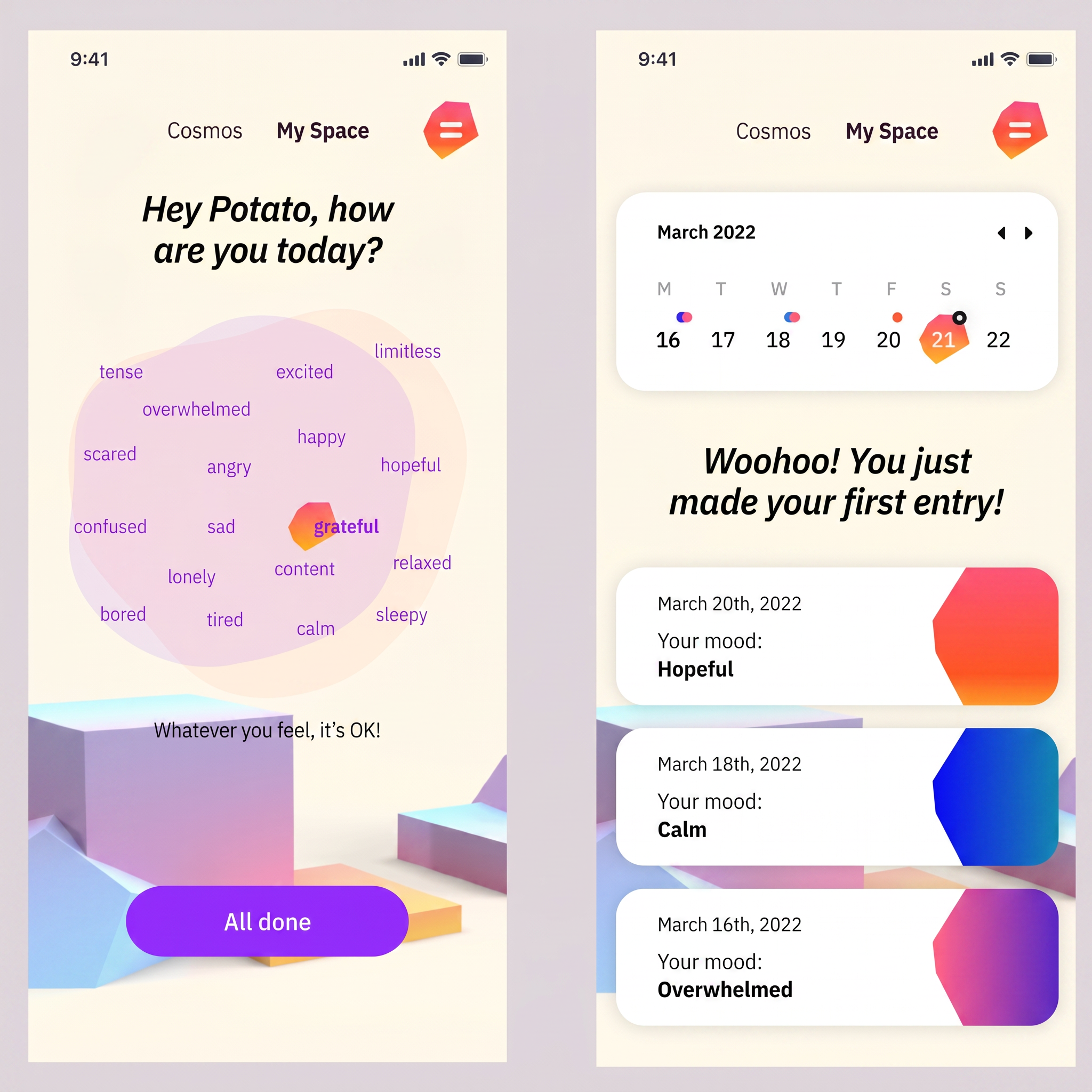
Single-emotion selection forced teens into one feeling — testing showed it didn't match how they actually described their day.
Redesign (UX testing)
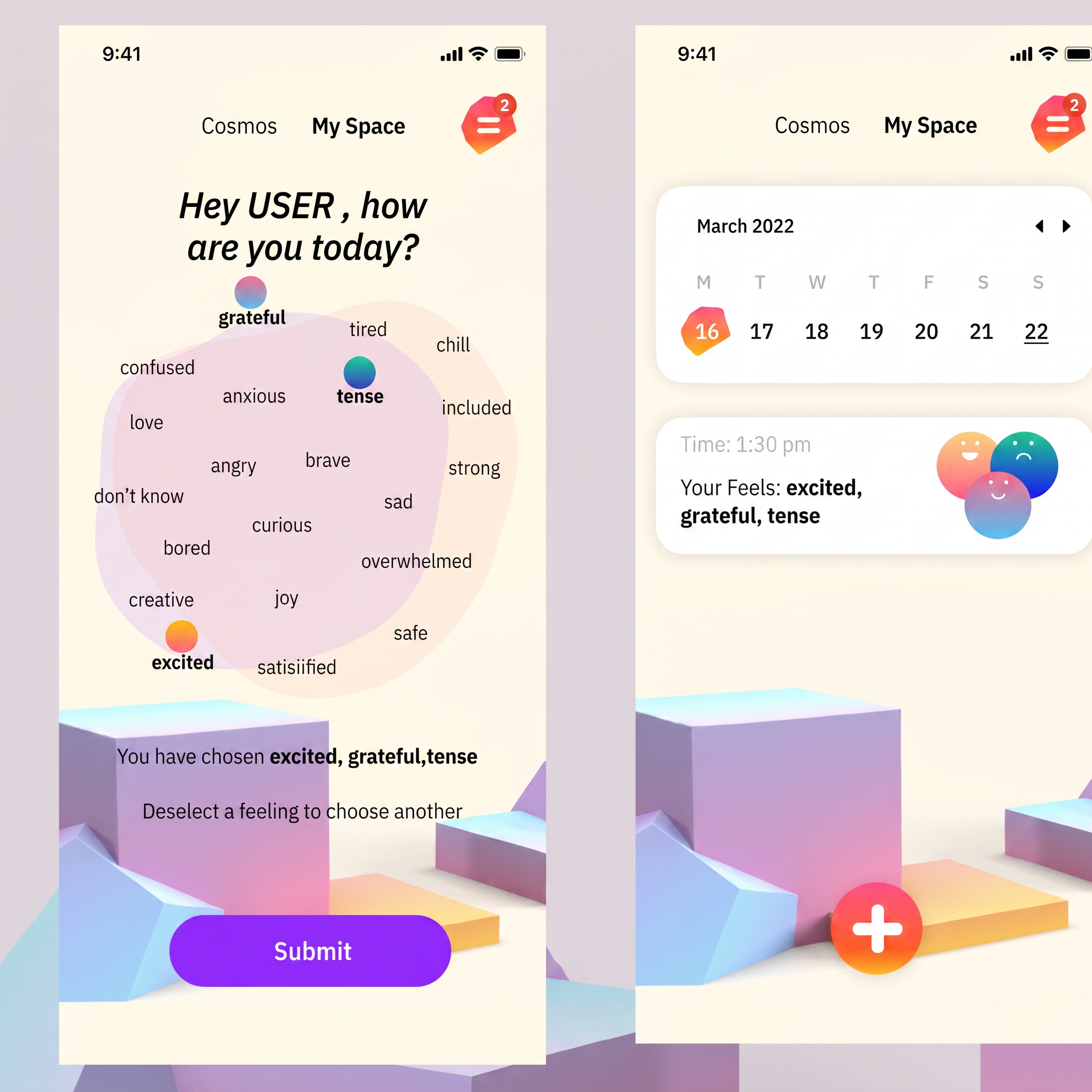
Multi-emotion check-in let users select several feelings at once, matching the real, layered way they described their experience.
Gamification over lecturing
The final concept centred on gamified journeys, guided journaling and research-verified content as an antidote to fake news — because engagement had to come before education could.
Ambition vs feasibility
My original vision for an interactive safety quiz posed real technical challenges. I worked with engineering to simplify journeys — more responsive technically, more intuitive for users.
Research
In the room with the audience
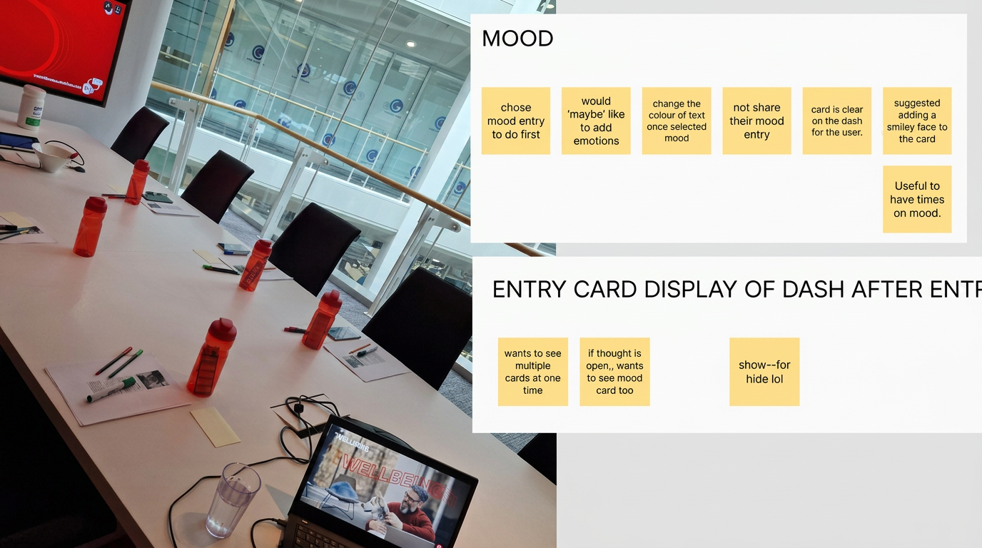
User interviews
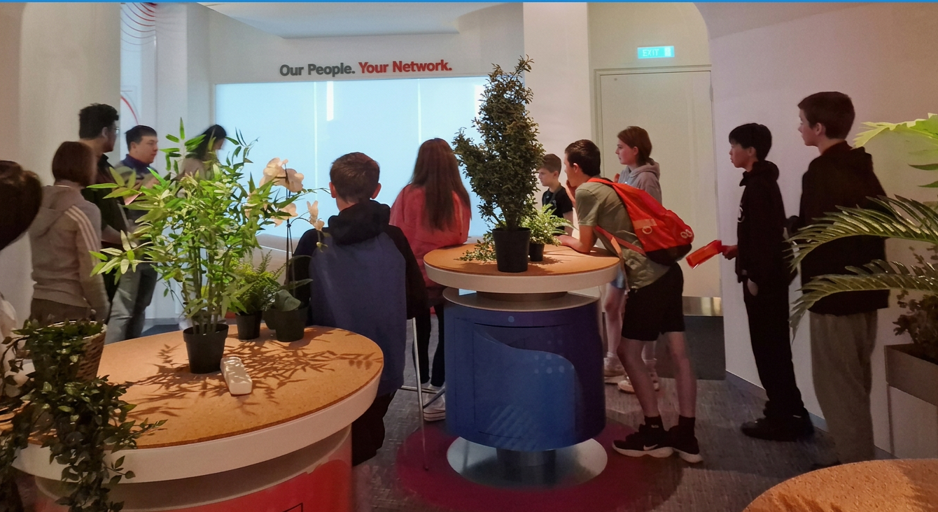
Focus groups
Journey mapping
Day 1 → Day 5, simplified
- 1
Day 1
Onboarding & mood check-in
- 2
Day 2
First gamified journey
- 3
Day 3
Journaling habit forms
- 4
Day 4
Content unlocks
- 5
Day 5
Notification brings them back
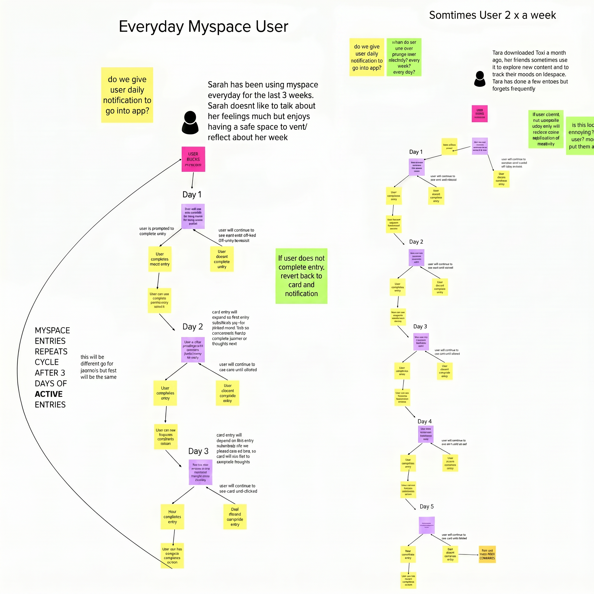
The original mapping session
Final app screens
Tozi in the hand
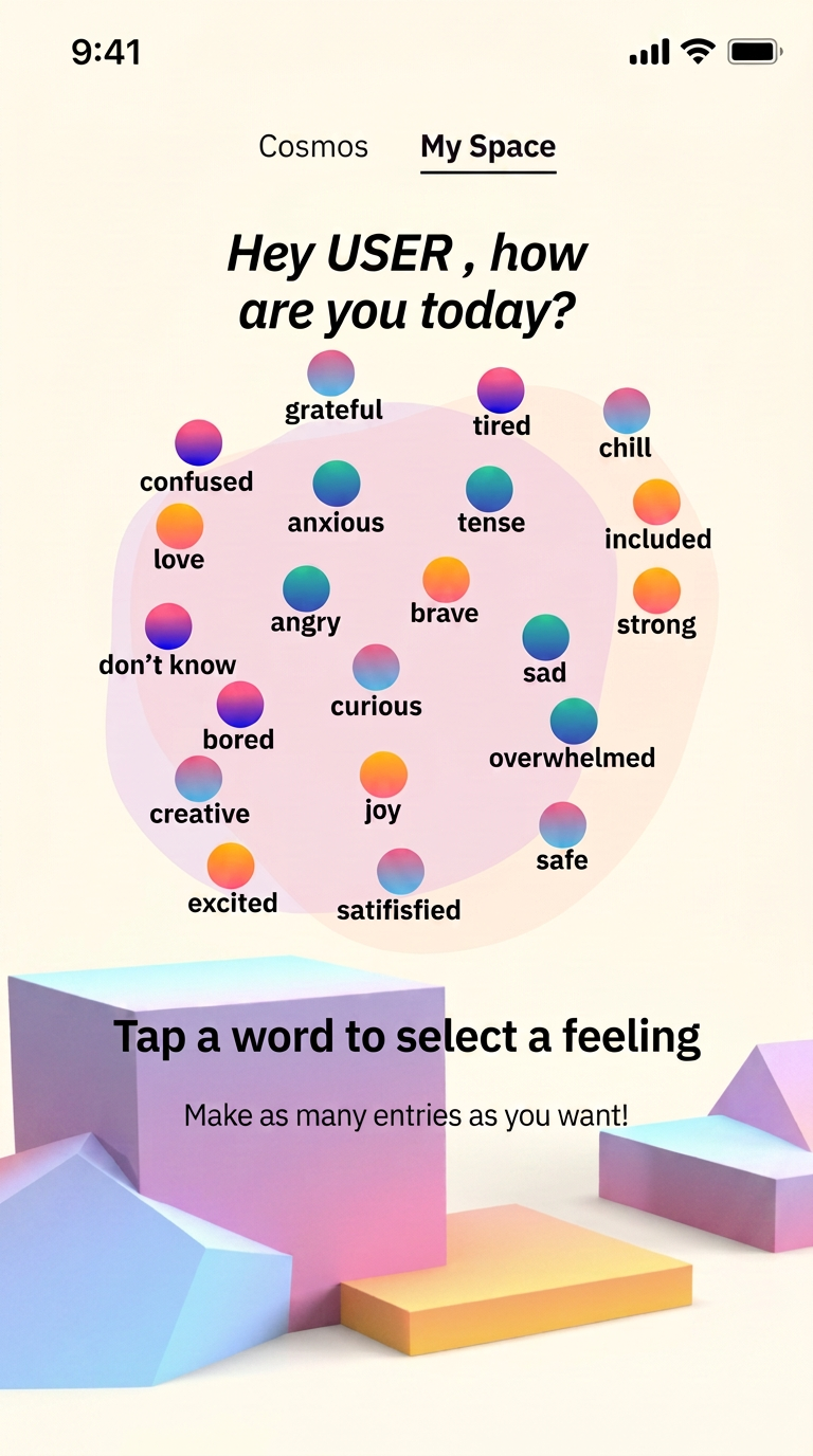
Multi-emotion check-in
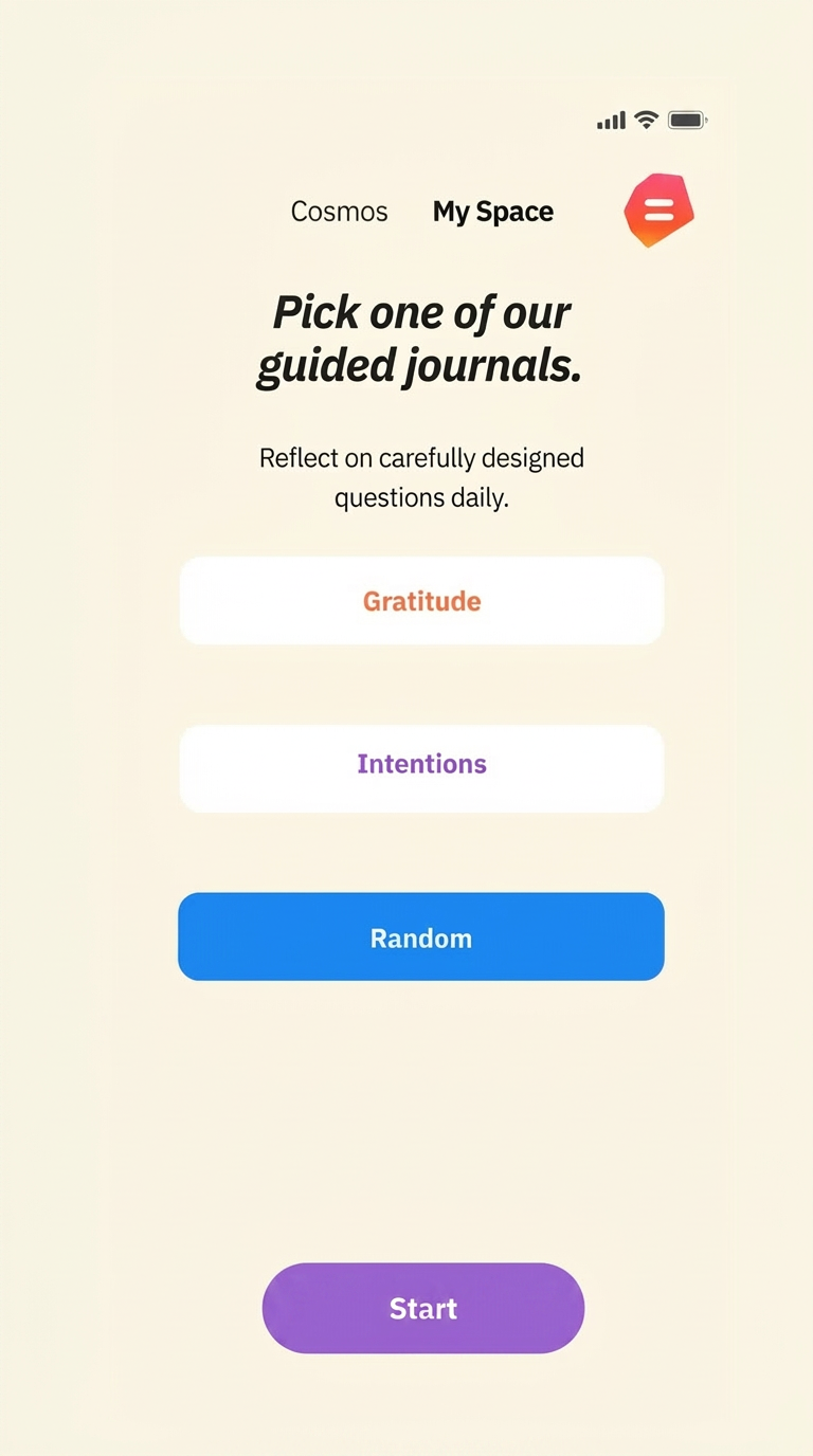
Guided journaling
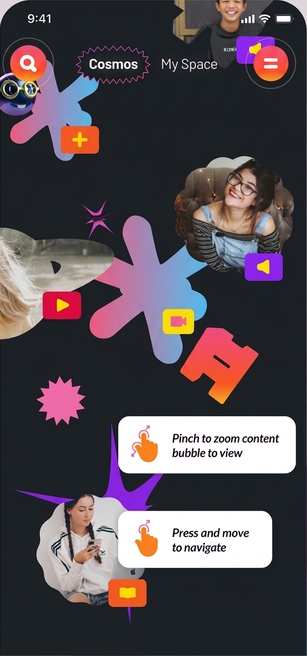
Gamified journey
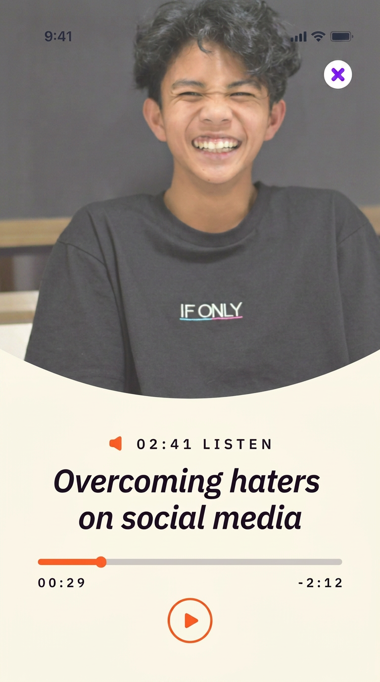
Verified content
The Tozi app is an extremely welcome development, one that will greatly improve the digital experience of children and young people.
John Church · ISPCC CEO